


Conversion rate optimization isn't simply about driving more traffic to your website. That's a common misconception. It's much more about maximizing the value of your website. each individual visitor, to specifically increase the number of users you already have. It's a systematic process aimed at getting more users to perform the exact action you want – be it a purchase, newsletter signup, or a simple contact request.
What Conversion Rate Optimization Really Means

Forget the cliché that simply changing a button's color from blue to green will instantly boost sales. True conversion optimization is far more complex. It's a discipline that delves deep into your customers' psychology, relies on rigorous data analysis, and considers everything from the user's perspective.
The real goal? We want to identify and ruthlessly eliminate friction points in the user journey. Every unnecessary click, every unclear form field, every loading time that becomes an exercise in patience – these are the obstacles we must remove. The path to conversion should be as easy and intuitive as a walk in the park.
Professional CRO is therefore not a guessing game, but a continuous cycle of clear steps:
- Analysis: We sift through quantitative data (what are users doing?) and qualitative insights (why are they doing it?) to truly understand the behavior.
- Hypothesis: Based on the data, we formulate a well-founded assumption. For example: "If we display the shipping costs directly on the product page, more users will start the checkout process because transparency increases trust."„
- Testing: This hypothesis is then tested in a controlled experiment, usually an A/B test.
This data-driven approach is the crucial difference. Decisions are no longer based on gut feeling or the boss's opinion, but on valid insights.
More than just one number
To be truly successful, you can't focus solely on the conversion rate. While it's the ultimate goal, many other key performance indicators (KPIs) provide crucial insights into where things are going wrong. Without these metrics, you're just groping in the dark.
The true value of CRO doesn't lie in achieving a magical, perfect conversion rate. It lies in building a system that continuously learns and adapts to the needs of your users. Every optimization, whether successful or not, is a valuable insight into your target audience.
In German e-commerce, the average conversion rate is approximately... 2,01 %. But be careful, this figure should be treated with caution, as the differences between sectors are enormous. While online retailers of everyday products often achieve higher rates, the tobacco and e-cigarette industry, for example, stands out with around 7,3 % out. Other sources even cite an average of 3,3 %. These figures demonstrate one thing above all: you need to evaluate your own performance within the context of your industry and focus on continuous improvement. More on this... Current conversion rate benchmarks can be found at digital-magazin.de.
Key KPIs for conversion rate optimization
For a truly holistic analysis, you need to keep an eye on several key performance indicators (KPIs). The following table provides an overview of the KPIs that go beyond the pure conversion rate and show you where the problems lie.
| KPI | Description | Why it's important |
|---|---|---|
| Bounce Rate | The percentage of visitors who leave your website after viewing only a single page. | A high bounce rate on important pages (e.g., landing pages) can indicate a discrepancy between advertising promises and page content. |
| Time on Page | The average time users spend on a particular page. | A short dwell time on content pages suggests that the content is not appealing or relevant enough. |
| Shopping cart abandonment rate | The percentage of users who add products to their shopping cart but do not complete the purchase process. | This is a critical indicator of problems in the checkout process, such as unexpected costs or a complicated form. |
| Click-Through Rate (CTR) | The ratio of clicks on an element (e.g., a button or link) to the number of impressions. | A low click-through rate (CTR) for important calls to action (CTAs) indicates that they are not convincing or visible enough. |
These numbers are your compass. They guide you to the weaknesses of your website and provide the basis for every sound optimization hypothesis.
Uncover weaknesses in the user journey
To truly improve your conversion rate, you first need to understand where and why visitors drop off along the way. Simply focusing on the final conversion number won't get you anywhere. Step into the role of a detective and uncover the real stumbling blocks in your users' journey.

First, let's look at the hard numbers, that is, the quantitative analysis. Here you will find the „"Where"“ of the problems. You need data that clearly shows you at which point in the process most people give up. Only when you know these critical points can you systematically investigate the root causes.
Visualizing the journey using funnel analysis
Funnel analysis is your best tool for this. Simply imagine the path to conversion – from the first click to the completed purchase – as a funnel. Sure, you'll lose a few users at each stage; that's normal. But if there's a sudden, huge drop at one point, you have a warning sign.
A typical funnel in e-commerce might look like this:
- Homepage visited: 10,000 users
- Product page accessed: 4,000 users (60 % exits)
- Product added to cart: 800 users (80 % exits)
- Checkout started: 400 users (50 % exits)
- Purchase completed: 200 users (50 % exits)
Do you see the problem? The jump from the product page to the shopping cart is a disaster. 80 % Of the people who view a product, none even add it to their shopping cart. This is a huge weakness, but the numbers alone don't tell us why.
Understanding behavior using qualitative methods
And now it gets exciting: We'll clarify that. „"Why"“. To find out the reasons for the dropouts, you essentially need to look over your users' shoulders. There are excellent, high-quality tools available for this.
- Heatmaps: These maps show you at a glance where users click, how far they scroll, and where their mouse hovers. You might discover that an important button is completely ignored simply because it's not visible.
- Session recordings: These are anonymized recordings of real user sessions. You can see live how someone struggles with your site – including hesitation, angry clicks ("rage clicks") on elements that don't work, and frustrated jumping back and forth.
Qualitative insights like these are invaluable. They transform dry statistics into tangible, human problems. You might discover that an ad banner is obscuring an important button or that mobile navigation is a disaster. Accessibility, in particular, is often underestimated but can cost you a significant number of conversions. Learn more about... Key features of accessible websites, in order to eliminate this source of error from the outset.
Pro tip: Connect your session recordings directly to funnel analysis. Filter specifically for recordings of users who abandoned your purchase at your critical weak point (e.g., during checkout). This allows you to see the exact problems that led to frustration.
From observation to hypothesis
Once you've clarified the "where" and the "why," you can finally formulate well-founded hypotheses for your A/B tests. This is the crucial step away from pure guesswork.
A practical example:
- Observation (quantitative): 80 % users do not add anything to their shopping cart.
- Observation (qualitative): Session recordings show that many users desperately search for shipping information and then leave the page in frustration.
- Hypothesis: If we place the shipping costs prominently and unambiguously right next to the "Add to Cart" button, more users will add the product because the uncertainty about additional costs is eliminated.
This approach ensures that you don't optimize blindly, but rather make data-driven decisions. Studies consistently show that a well-thought-out and optimized checkout process can drastically reduce abandonment rates. On average, this can increase the conversion rate by 20 % to 40 % increase.
By combining hard data with real user insights, you create a solid foundation for systematic and sustainable optimization. You stop guessing and start solving your customers' problems directly.
From data overload to a powerful hypothesis
Data alone is useless. The true treasure in your funnel analyses and session recordings only emerges when you transform the insights into concrete, testable ideas. A clearly formulated hypothesis is the foundation of every A/B test. It prevents you from wasting valuable resources in a haphazard "let's try this, let's try that" mode.
The structure of a good hypothesis is surprisingly simple, yet incredibly effective. It creates a clear connection between what you have observed, what you want to change, and what you expect to achieve. This simply forces you to think logically and purposefully.
A tried and tested formula that we use time and again is: When we implement [the change] for [this target group], then [this result] happens because [our observation].
The hypothesis as your strategic compass
Let's bring this to life. Remember our example from the last chapter? The users who fled the shopping cart en masse because they couldn't immediately find the shipping costs? One hypothesis could sound like this:
If we Display the shipping costs clearly and prominently directly next to the "Add to Cart" button on the product page., then The add-to-cart rate increases by 15 %, because Our session recordings have shown that users leave the page after searching in vain for exactly this information.
See? This is no longer a vague assumption. It's a strategic statement that establishes a clear cause-and-effect relationship and, above all, is measurable. This ensures that every optimization is based on a solid data foundation and not just gut feeling. This structured approach is crucial not only here, by the way; it's also the core of a good... Instructions for keyword research.
Too many ideas? Here's how to find the gems.
Once you start working systematically, your list of test ideas will explode. That's a good thing! But your time and that of your developers is limited. You can't implement everything at once. So the crucial question is: Where do you begin?
This is precisely where a prioritization framework comes into play. One of the most pragmatic and effective models is the... PIE framework. It forces you to evaluate each idea based on three simple criteria:
- Potential: How significant is the impact this change could have? An adjustment on a page with high traffic or very close to the point of purchase usually has greater potential.
- Importance: How critical is this page to your business? Optimizing the checkout process is almost always more important than optimizing the "About Us" page, which hardly anyone visits.
- Ease (simplicity): How quickly and easily can the test be implemented from a technical and design perspective? A text change can be done in minutes, while a complete redesign of the checkout can take weeks.
For each point, you assign a score from 1 (very low) to 10 (very high). The final PIE score is simply the average of the three values. You tackle the hypotheses with the highest scores first.
The PIE framework in action
Let's imagine an online shop with two promising hypotheses:
- Hypothesis A: We are changing the CTA text on the product page from "Add to cart" to "Order securely now".
- Hypothesis B: We are transforming the cluttered, one-sided checkout into a clearer, multi-step process.
Now we throw both ideas into the PIE funnel:
| criterion | Hypothesis A (CTA text) | Hypothesis B (Checkout redesign) |
|---|---|---|
| potential | 6 (could noticeably increase the click-through rate) | 10 (could massively reduce the dropout rate) |
| Importance | 8 (Product page is a key page) | 10 (the checkout is the most important page of all) |
| Ease | 10 (minimal technical effort) | 2 (very high development costs) |
| PIE score | 8.0 ((6+8+10)/3) | 7.3 ((10+10+2)/3) |
Although redesigning the checkout process has far greater potential, a simple text change is the clear winner here. Why? Because it offers a fantastic ratio of potential gain to minimal effort – a classic "quick win." This pragmatic approach ensures that you use your resources wisely and continuously and efficiently boost your conversion rate.
The most important levers you can pull now
Once you know where the problems lie and what your priorities are, it's time to get down to brass tacks. Consider the following points as your personal checklist – here you'll find the most effective levers to noticeably improve your conversion rate. Often, it's just small, targeted adjustments that make all the difference.
Landing pages that have a clear mission
Your landing page has only one goal: to motivate the visitor to take a very specific action. Anything that distracts from this is dead weight and must be removed. The most important rule here is: Value proposition (Value Proposition) to be immediately crystal clear and to the point – directly in the visible area of the page („above the fold“).
Anyone who lands on your site must receive an answer to these questions within seconds:
- What What exactly is offered here?
- For whom Is that what it's supposed to be?
- What specific advantage? What do I get out of it?
Avoid empty marketing rhetoric. Instead of "We optimize your processes," a statement like "Save 10 hours of administrative work per week with our software" is far more impactful. It's tangible and demonstrates a real solution. For detailed instructions on how to optimize your website, read our comprehensive guide on the topic. Optimize landing page.
Calls to action that truly entice users to click
The call to action (CTA) is the crucial trigger, the moment of truth. A boring "send" button won't impress anyone. Good CTA text is motivating and clearly illustrates the benefit of the action to the user.
Try it like this:
- „"Request a free quote now" instead of "Continue"“
- „"Secure my spot in the webinar" instead of "Register"“
- „"Get instant access" instead of "Buy"“
But color and placement also play a huge role. The button must stand out from the rest of the page, practically jump out at the user. Position it where the user naturally expects to find it after an informational section. In most cases, a single, eye-catching CTA per section works best.
Forms that people enjoy filling out
Let's be honest: Nobody likes filling out forms. Every single field is a potential obstacle that drives up the abandonment rate. Therefore, ask yourself ruthlessly for each field: Do I really need this information? really now?
Keep your forms as short as possible. Often, an email address and perhaps a name are enough to get the ball rolling. You can always ask for any further details later in the customer interaction.
More quick tips for better forms:
- Visible labels: Placeholder text that disappears while typing is often confusing. Labels that remain permanently visible are the safer choice.
- Report errors in real time: Show the user immediately if an entry is incorrect – not only after they have clicked "Submit" in frustration.
- Use the progress bar: In multi-stage processes, such as checkout, you provide the user with guidance and show them how far they have come. This is motivating.
Trust: The most important currency online
Visitors who don't yet know you need to build trust before they're willing to entrust you with their money or data. This trust doesn't develop automatically; it's the result of targeted signals on your website.
- Social proof is worth its weight in gold: Genuine customer reviews, testimonials with photos, or even short video statements are incredibly convincing. Nothing works better than another customer's positive experience.
- Seals and certificates create security: Well-known logos such as Trusted Shops, TÜV certificates or important industry awards signal trustworthiness at first glance.
- Prices must be transparent: Hidden costs are a major conversion killer. Disclose shipping costs, taxes, and all other fees as early and transparently as possible.
Especially in the B2B sector, it is crucial to communicate the benefits directly. Data shows that 87 % successful offers It should include a clear ROI calculation for the customer. Personalization and speed are also crucial: studies show that personalization strategies increase conversion rates by an average of [amount missing]. 42 % increase. At the same time, the chance of a conversion drops drastically after just 4 hours without a response to an inquiry. 35 %. How top companies achieve three times higher conversion rates, You can read more about it here.
Mobile devices and charging time: The underestimated success factors
The majority of your traffic likely comes from mobile devices today. A website that looks great on a desktop but is a disaster on a smartphone is throwing money away. Regularly click through your site yourself on your phone. Are the buttons large enough to tap with your thumb? Is the text easy to read? Do the forms work without annoying zooming?
Directly related to this is loading time, or page speed. Even a one-second delay can reduce your conversion rate by up to... 7 % Press. Users have no patience. So compress your images, optimize your code, and use caching technologies. Fast page speed is no longer just a technical detail, but a fundamental revenue driver.
A/B testing and multivariate testing: How to find the real winners
A good hypothesis is half the battle, but at the end of the day, only what works in practice counts. This is precisely where A/B testing and multivariate testing (MVT) come into play. They form the scientific foundation of conversion optimization, transforming mere assumptions into solid, measurable facts. Without a sound testing process, even the most brilliant idea remains mere speculation.
The key is to understand which test is right for which situation. It's not about always choosing the most complex method, but the most appropriate one.
A/B test or multivariate test? A question of strategy.
The A/B test This is the absolute classic and, in most cases, the perfect starting point. The principle is incredibly simple: You test a modified version of your page (Variant B) against the original (Variant A). The traffic is split 50/50, and in the end, you see in black and white which version converts better. This method is perfect for validating individual, larger changes – be it a completely new page layout, a radically different call to action, or a drastically simplified form.
A multivariate test (MVT) However, it's the tool of choice if you want to understand the subtle nuances. Imagine you want a new headline, a different image. and Test a new button text simultaneously. An MVT automatically runs through all conceivable combinations of these elements and reveals which specific mix works best. But be warned: This method requires significantly more traffic to deliver statistically sound results.
The most common mistake in testing by far is impatience. Never end a test prematurely just because one variant is slightly ahead after two days. Statistical significance takes time and sufficient data to rule out chance occurrences.
The following infographic summarizes the key levers that often form the basis for successful A/B tests – from landing page design and forms to elements that build trust.
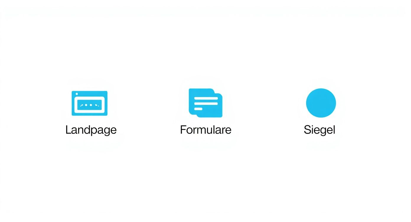
This clearly shows that optimization is not a one-off project, but rather addresses various crucial touchpoints to improve the overall user experience.
The Testing Workflow: A Roadmap to Success
Successful tests always follow a clear procedure. Random trial and error only leads to data chaos and incorrect conclusions. Instead, proceed systematically.
- Define hypothesis: It all starts with your clear "if-then-because" hypothesis. What exactly are you testing, what result do you expect, and—most importantly—why?
- Select tool: The market is full of testing tools. Previously, Google Optimize A popular free option, today there are professional suites such as VWO or Optimizely. Choose the tool that suits your budget and technical skills.
- Set conversion goal: What exactly constitutes success for you? A click on the buy button, the submission of the contact form, or the download of a white paper? You must define this goal precisely in the tool.
- Planning for significance and duration: Determine how reliable your result should be – typically, 95 % Statistical significance. Use an online calculator to estimate how much traffic and time you need for a reliable result before you start.
- Start the test and keep your hands off: Once the test is running, the rule is: hands off! Resist the temptation to peek at the interim results daily and prematurely terminate the test.
Interpreting results and learning from every test
Imagine you've tested a new, interactive product gallery against your old, static version. Variant B (the interactive one) wins by a margin of... 18 % higher basket rate and a statistical significance of 97 %. The result is crystal clear: The new gallery is needed.
But what if a test fails or doesn't bring about any relevant change? That's not a failure, but a valuable insight! It simply means that the tested change didn't make a noticeable difference for your users.
My tip: Be sure to introduce one Test logbook. Document each hypothesis, its duration, the results, and your conclusions. Over time, this logbook will become an invaluable knowledge base about the preferences and behavior of your specific target audience. You'll learn what works for your customers and what doesn't – and this knowledge is the fuel for a sustainably improved conversion rate.
Frequently asked questions about conversion rate optimization
When working on conversion optimization, we repeatedly encounter the same questions. To allow you to fully concentrate on what's essential – namely, achieving more conversions – I've compiled the most common uncertainties from practice and answered them briefly and concisely.
What constitutes a good conversion rate?
That's probably the classic question of all. The honest answer I give everyone is: it depends. A universally "good" conversion rate simply doesn't exist. The value depends heavily on your industry, your business model, the traffic source, and even the price of your products.
In German e-commerce, we often see an average of approximately 2–3 %. A specialized niche shop can also achieve values of over [amount missing]. 7 % crack, while a provider of high-priced B2B services might already be able to do so with less than 1 % It is extremely successful because every single degree counts.
Forget constantly looking at industry benchmarks. Instead, focus on your own Beating the conversion rate month after month. That's the only metric that truly matters for your business and brings sustainable success.
How many visitors do I need for an A/B test?
Here too, there's no fixed number, but a clear rule of thumb. The required number of visitors depends directly on your current conversion rate and the expected improvement (the so-called "uplift"). The smaller the anticipated change, the more traffic is needed to obtain a statistically sound and reliable result.
To achieve statistical significance of 95 % To achieve this, you often need several thousand visitors per test variant and at least 100–200 conversions.
My practical tip: Before each test, use an online sample size calculator (simply search for "Sample Size Calculator"). This way, you'll know in advance whether you have enough traffic to obtain a meaningful result and won't waste any time.
Can I optimize the conversion rate even without a budget?
Absolutely! Especially in the beginning, many of the most effective measures are completely free. Focus on the so-called "low-hanging fruit"—that is, small changes with potentially big impact that you can implement immediately.
Here are a few ideas to get you started:
- Adjust text: Make your headlines and call-to-action buttons clearer and more persuasive.
- Streamline forms: Go through your forms and remove every single field that isn't absolutely necessary. Every field is an obstacle.
- Get genuine feedback: Ask your customers directly via email or a short survey on your website what they want or where they're experiencing problems. You'll be surprised by what you find out.
The necessary analysis work can often be done with free tools such as Google Analytics or the basic version of Hotjar Get it done. In the end, perseverance and creativity are often more important than a bulging budget.
How long should an A/B test run?
The duration of the test is less important than reaching the pre-calculated sample size. However, a test should run for at least one, ideally two, full weeks. Why? Because user behavior on weekdays often differs significantly from that on weekends. This way, you compensate for these natural fluctuations and avoid skewing your results. And very importantly: Never end a test prematurely just because one variant is ahead after two days. That's a classic beginner's mistake.
Do you want to systematically improve your online presence and reach the top of Google's search results? LinkITUp is your specialized SEO agency with over 15 years of expertise. We help you sustainably increase your visibility with tailored strategies. Learn more at our website.