


Landing page optimization is about strategically adjusting the key elements of your page – from the headline and call to action to the design – to guide visitors to the exact action you want them to take. Every click on an ad is an investment. Without a well-designed landing page, however, this budget often goes to waste without yielding any measurable results.
Why optimizing your landing page determines success or failure
Imagine you're pumping a four-figure sum into advertising every month. Thousands of visitors land on your site, but at the end of the month, you only have a handful of inquiries in your inbox. Sound familiar? For many businesses, this is exactly the reality.
Therefore, the Landing Page Optimization Not a nice extra, but an economic necessity. It's not about adding more. more It's not about buying traffic, but about getting the most out of the visitors you already have.
The success of your website depends solely on how well you understand your visitors and meet their needs. Often, even small adjustments can have a huge impact. A software provider I know reduced the number of fields in their demo form from six to three and changed the button text from "Submit" to "Request Demo." Sounds trivial, right? The result was a 30 % higher conversion rate.
The three cornerstones of a convincing landing page
A landing page that truly converts always rests on a solid foundation. Before you get lost in the details, these three elements must be in place:
- A crystal-clear value proposition (MSRP): Your visitor has no time. They need to understand within seconds what problem you solve for them and what makes your offer so special.
- Real social proof: Nothing is as convincing as the opinions of others. Customer testimonials, case studies, or the logos of well-known partners build trust and alleviate the fear of making the wrong decision.
- A clear call to action (CTA): The call to action must be clearly formulated, visually prominent, and logically placed. The user shouldn't have to think for a second about what the next step is.
First impressions matter. A well-known study has shown that users form an opinion about your website's design within just 50 milliseconds. A cluttered page will drive visitors away before they've even read a single line.
These fundamentals are the starting point for any successful optimization. If you want to delve deeper and go beyond these basics, we'll show you how to optimize your [system/product] in a more advanced article. Optimize conversion rate.
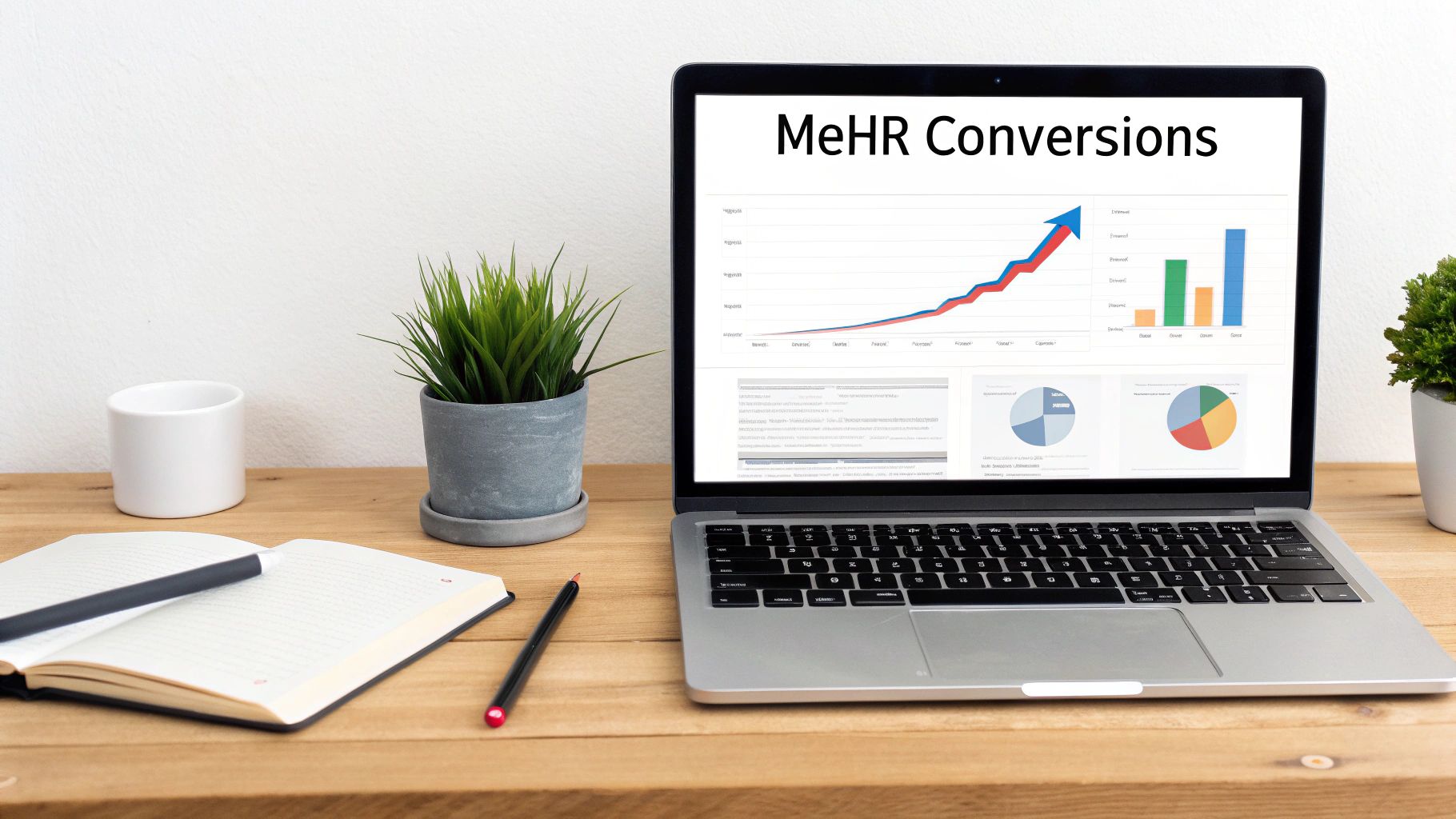
Ultimately, it's not just about getting more traffic, but about intelligently converting that traffic into customers. The average conversion rate for landing pages in Germany is approximately... 6,6 %. Really good pages can even break the 10 % mark. An analysis by Unbounce revealed that the top 25 % landing pages for service providers achieve a conversion rate of 5.31 %. Learn more about how to specifically Learn how to optimize landing pages for service companies at netzpunkte.de. Every single percentage point you gain here directly translates into more inquiries and more revenue.
Texts that truly convince your visitors
Think of your landing page as a silent sales conversation you have with each individual visitor. Your words are the crucial tool here. It's not just about dryly listing facts. Rather, you need to establish a connection, build an emotional bridge, and ultimately deliver a crystal-clear call to action. Good copy is what turns a passive reader into an active customer.
The absolute key to this? You have to speak the language of your target audience. A really good one. Landing Page Optimization It always starts with understanding the real needs, doubts, and desires of your potential customers down to the last detail. Only when you succeed in this can you formulate texts that hit the mark and make the visitor feel: "Wow, I'm exactly where I need to be."„
The AIDA formula in practice: Here's how it works
The AIDA formula is a marketing classic, but it works better than ever today for structuring truly persuasive texts. The principle divides the process into four simple phases: Attention, Interest, Desire, and Action.
Let's look at a concrete example: a landing page for an e-learning platform aimed at project managers.
Attention: Your headline is the key. Instead of a yawn-inducingly boring "Online Courses for Project Management," try something like this: „"Become a sought-after project manager – with the skills that really matter."“ This directly engages the reader with their career goal and sparks curiosity.
Interest: Now you have their attention, so you need to keep it. Describe briefly and concisely what visitors can expect: "Learn in practical modules how to confidently manage complex projects, stay within budgets reliably, and motivate your team to achieve peak performance." Active verbs, tangible results – that's what counts here.
Desire: In this phase, a simple feature becomes a genuine desire. Instead of just saying "10 courses available," rephrase it: „"Master the essential skills for your next promotion in 10 courses."“ This sentence paints a clear picture of personal gain and awakens the desire to achieve exactly that.
Action (plot): The call to action (CTA) must be an unambiguous command. „"Secure your course place now"“ This creates a completely different sense of urgency than a passive "registration".
Texts that consistently focus on customer benefits simply convert better. This isn't just speculation. A study by MarketingExperiments has shown that a benefit-oriented headline can increase the conversion rate by a significant amount. 41 % can increase – compared to a purely functional description.
Enough with the features, let's focus on the benefits!
One mistake I see time and again: landing pages that simply rattle off product features. But let's be honest: your visitors aren't interested in the technical details. They want to know how your offer solves their problem or makes their life easier (benefits).
This translation is the heart of a good Landing Page Optimization. It's about showing empathy and proving that you see the world through your customers' eyes.
| Feature | The benefit for the customer (Benefit) |
|---|---|
| 24/7 customer support | „"You will receive immediate help at any time, so that your project never stalls."“ |
| Flexible learning times | „"Learn when and where you want – perfectly integrated into your busy workday."“ |
| Certificate upon completion | „"Prove your new skills in writing and increase your market value."“ |
Finding the right words to describe these benefits is an art in itself and should be based on solid analysis. You can find more information about the fundamentals in our comprehensive [document/section/etc.]. Keyword Research Guide.
Building trust with authentic social proof
Nothing is more convincing than another customer's positive experience. Social proof – testimonials, case studies, or customer logos – is your strongest ally for building trust and addressing objections before they even arise.
Be sure to include customer testimonials that mention very specific results. A quote like, "Thanks to the course, I was able to complete my last project..." 15 % "Finishing under budget" is infinitely more valuable than a generic "Great course!".
A practical tip: Place relevant testimonials precisely where readers might have doubts. A quote praising the fantastic support, for example, fits perfectly next to the price overview. This alleviates potential customers' fears of making a bad investment. Authenticity is key here – use real names and, if possible, real photos of your customers.
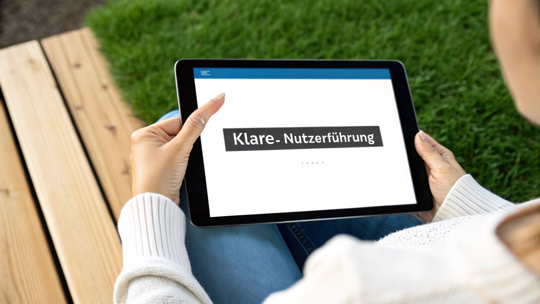
Design and UX for intuitive user guidance
The best design is invisible. It guides the user so effortlessly to their goal that they don't even question the path. A cluttered or confusing design, on the other hand, acts like an obstacle course – and is the surest way to lose a potential customer before they've even understood your offer.
In practice, the Landing Page Optimization It's all about user experience (UX). It's about creating an environment that not only looks great, but above all, functions flawlessly. Every click, every interaction, and every visual element must serve a clear purpose: guiding the visitor towards conversion.
Visual hierarchy and the psychology of color
The human eye automatically follows patterns. A well-designed visual hierarchy takes advantage of this and directs the gaze precisely where it should go. The most important elements – your headline, your value proposition, and your call to action (CTA) – must immediately catch the eye.
Colors are your most powerful tool. They evoke emotions and create contrasts that guide the eye. A primary brand color works best, complemented by a secondary accent color that you exclusively for clickable elements such as the CTA button use it. This way, the user subconsciously learns which elements encourage interaction.
In my experience, the "rainbow effect" is a classic beginner's mistake. Too many colors vie for attention, resulting in visual chaos. Limit yourself to a color palette of no more than three colors. This looks clear, professional, and focused.
An often underestimated but crucial element is the White Space (White space). This isn't wasted space, but an active design element. Well-used white space gives your content room to breathe, greatly improves readability, and puts the truly important areas of your page in the spotlight.
The call to action: your visual anchor point
The call to action (CTA) is the most important button on the entire page. If it gets lost in the crowd, the battle is already lost. Heatmap analyses consistently show the same pattern: users ignore buttons that barely stand out from the background or are overwhelmed by other graphics.
For a truly effective CTA, I have three simple rules:
- Striking contrast: The button must be immediately visible and clearly stand out from the rest of the page.
- Meaningful text: Instead of a boring "Send," use active, benefit-oriented text. Try "Request your free analysis now" or "Download my copy.".
- Smart placement: The call to action (CTA) belongs "above the fold"—that is, in the area visible without scrolling. For longer pages, you should definitely repeat it at the end.
Optimize forms and send abandonment rates plummeting.
A poorly designed form is the ultimate conversion killer. Every additional field is another hurdle and increases the likelihood that the user will give up in frustration. Ask yourself ruthlessly about each individual field: Do I really need this information right now?
For initial contact, an email address is often sufficient. You can ask for anything else later in the process.
- Less is more: Reduce the number of form fields to the absolute minimum.
- Clear labeling: Use placeholder text as an aid, but never as a replacement for permanently visible labels over the fields.
- Immediate feedback: Use color coding to show users directly whether an entry is correct or incorrect. This prevents frustration.
- Think mobile: The fields must be large enough on the smartphone and easy to fill in without having to zoom.
The bounce rate is a merciless but honest indicator here. A bounce rate of More than 70 % on lead generation pages is considered bad in German-speaking countries.. The most common causes, besides slow loading times, are also poor usability, such as that caused by overloaded forms.
A high bounce rate can be frustrating, but it provides valuable insights. The table below summarizes the most common problems and proven solutions to keep your visitors on your site.
Checklist for reducing high bounce rates
This table shows typical causes for high bounce rates and provides directly implementable solutions to improve the user experience.
| Problem area | Possible cause | Practical solution |
|---|---|---|
| First impression | Unclear value proposition or visual chaos | Clear, user-oriented headline; use of white space and visual hierarchy |
| Forms | Too many or unclear fields | Reduce fields to the absolute minimum; use clear labels and autofill options. |
| navigation | Confusing menus or lack of focus | Remove all distracting links (e.g., main menu) from the landing page; ensure a clear path to the CTA. |
| Charging time | Page loads too slowly (> 3 seconds) | Compress images; enable caching; remove unnecessary scripts |
| Mobile view | Poor display quality on smartphones | Ensure responsive design; make touch targets large enough; use a mobile-friendly font size. |
These targeted adjustments will allow you to remove the most common obstacles and noticeably improve the user experience.
Visual design is inextricably linked to accessibility. High-contrast colors and clear structures not only help all users but are also essential for people with visual impairments. In our guide, we show you how to create a Create an accessible website and thus open the doors to absolutely all visitors.
Technical performance and SEO basics
A brilliant landing page can be incredibly convincing – but if it takes forever to load or remains invisible to Google, it's practically worthless. Design and text are only half the battle. If the technical foundation isn't solid, visitors will abandon the site before they've even read a single line. The technical Landing Page Optimization It is therefore the invisible, but absolutely crucial framework for your success.
Your landing page not only needs to look good, but also perform well. That means loading lightning fast and being easily understood by search engines like Google. Otherwise, it's like having the most beautiful trade show booth in the world – only it's in a warehouse that nobody can find.
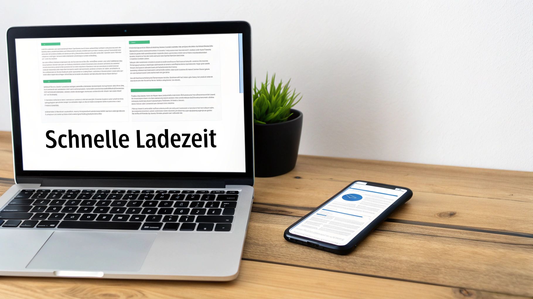
Why loading time overshadows everything else
Loading time isn't just a nice extra; it's a crucial ranking factor and one of the biggest levers for your conversion rate. The numbers don't lie: studies repeatedly show that even a one-second delay can reduce conversions by up to... 7 % can press. Patience is a rare virtue online.
To find out where you stand, Google PageSpeed Insights Your most important ally. This tool not only gives you a grade, but also very specific instructions for action. It's best to start with these quick optimizations:
- Compress images: Huge image files are the number one loading time killer. Use tools like... TinyPNG or the built-in tools of your CMS to shrink images without visible loss of quality.
- Enable browser caching: This technique ensures that parts of your website are cached in the user's browser. When they return, the page loads significantly faster because it no longer needs to be fetched from the server.
- Remove unnecessary scripts: Every additional plugin, every tracking script can slow down your site. Regularly take stock and get rid of anything that isn't essential.
Speed isn't just an IT metric; it's a direct measure of user experience. A slow website subconsciously signals to the user: "Your time isn't important to us." That's poison for trust and the willingness to convert.
SEO basics specifically for landing pages
Even if your landing page is primarily intended for paid traffic, i.e., ads, you shouldn't ignore SEO basics. A good organic ranking can bring you valuable, free traffic. Furthermore, a clean SEO structure helps Google better understand the content and purpose of your page, which can even positively impact ad quality.
User-friendly URLs are mandatory.
Your URL should be short, concise, and self-explanatory. An address like your-company.de/offer-erp-software is far superior to your-company.de/lp-123-final. This way, not only Google but also the user knows immediately what to expect.
Meta title and description: Your calling card on Google
The meta title and description are your first point of contact in the search results. They determine whether someone clicks on your link – or on that of your competitor.
| element | Purpose | Example of a tax advisor |
|---|---|---|
| Meta-title | Attract attention, place the main keyword | „"Modern tax advice for SMEs | Secure your initial consultation now"“ |
| Meta description | Make a value proposition, encourage clicks. | „Save time and money. We digitize your accounting and provide proactive advice for your success. Schedule your free consultation now!“ |
These two elements are absolutely key factors for a good click-through rate (CTR) and belong to every professional Landing Page Optimization.
There's no way around mobile optimization.
The reality is: the majority of your traffic now comes from smartphones. A landing page that doesn't function flawlessly on mobile devices is essentially worthless. It's about much more than simply squeezing the page onto a small screen.
Pay particular attention to these points from a practical perspective:
- Readability: The font must be large enough that you don't have to squint or zoom in.
- Accuracy: Buttons and links need enough space around them. Nothing is more frustrating than constantly typing in the wrong place.
- Mobile Performance: On a mobile phone, loading time is even more critical, as the internet connection is often less stable. Every kilobyte you save here pays off twice over.
Don't rely solely on simulators. Grab real smartphones and test the site yourself. Only then will you truly understand how the site feels to your users. A seamless mobile experience is no longer optional, but absolutely essential for the success of your landing page.
A/B testing: How to make data-driven decisions
Optimization without data is and always will be a guessing game. Sure, you can rely on your gut feeling, but let's be honest: that can be wildly misleading and, in the worst case, even worsen the results. Systematic Landing page optimization Replace this guesswork with hard facts. And this is where A/B testing comes in – probably your most important tool.
Targeted testing helps you determine which changes truly make a measurable difference in your visitors' behavior. Simply pit different versions of your website against each other, and the data will show you which version comes out on top. This way, your decisions are no longer based on vague assumptions, but on real user behavior.
From hypothesis to concrete result
Every good A/B test starts with a sound hypothesis. This is essentially a well-founded assumption about how a particular change will affect the conversion rate. Ideally, this assumption is based on observations, user data, or proven psychological principles.
A sound hypothesis almost always follows this simple pattern: If I make [change X], then [result Y] will occur because [reason Z].
Let's imagine a specific scenario: You have a landing page for a free ebook. The current headline is "Our Guide to Digital Marketing." Sounds okay, but you suspect it's too general and doesn't clearly highlight the direct benefits.
From this, you could formulate the following hypothesis:
- If I change the heading to „Double Your Leads in 90 Days – Our Tried and Tested Guide“,
- then the number of downloads is increasing,
- because The new headline promises a concrete, tangible benefit and is therefore simply more convincing.
An A/B test without a clear hypothesis is like a journey without a destination. You might arrive somewhere, but you won't know why – and you certainly won't be able to replicate the success. Therefore, always formulate your hypothesis first., Why They believe that a change will work.
Putting the A/B test into practice
Once the hypothesis is established, the focus shifts to the technical aspects. This involves using tools such as... VWO or Optimizely (Since the once popular Google Optimize has unfortunately been discontinued), the technical part is thankfully no longer rocket science. You create two versions of your landing page:
- Variant A (Control): Your original page with the old heading. That's your starting point.
- Variant B (Variation): The new page with the changed, user-oriented heading.
The tool then splits the incoming traffic automatically. 50 % The visitor sees the old version, the others 50 % The new one. Now let the test run for a while and measure which variant generates more conversions – in our case, downloads.
A very important tip from practical experience: Only ever change... a central element per test. If you simultaneously change the heading, the button text, and the main image, you won't know which of these three changes was responsible for the result.
Correctly reading and interpreting results
A test is only truly meaningful if it provides a statistical significance has reached this value, which is usually reached at 95 % The probability of your result being calculated tells you how likely it is that it wasn't just pure chance. Fortunately, most A/B testing tools display this value automatically.
Give the test enough time. Running it for only two days rarely yields reliable data. Seasonality or differing user behavior on weekends can skew the results. A runtime of at least one to two weeks is usually a good guideline to compensate for such fluctuations.
| Metric | What it means for your test | What you should pay attention to |
|---|---|---|
| Conversion Rate | The percentage of visitors who achieved your goal (e.g., download). | Which variant has the higher rate? That's the obvious indicator. |
| Statistical significance | The probability that the result is not a coincidence. | Wait until the value of % is >95 before making a final decision. |
| Number of conversions | The absolute number of goals achieved per variant. | Enough conversions must be collected to rule out chance. |
Once the test is complete, it's time for analysis. If your variant B, with the new headline, achieves a significantly higher conversion rate, you have a clear winner. Implement the new headline permanently for all visitors and start planning your next test immediately.
Because Landing page optimization This isn't a one-off project. It's an ongoing cycle of hypothesis, testing, analysis, and learning. Every single test—regardless of whether it's a success or not—provides you with invaluable insights into your target audience's mindset. And every insight brings you one step closer to the perfect converting page.
Frequently asked questions about landing page optimization
In practice, the same questions repeatedly arise when optimizing landing pages. This is perfectly normal, as the devil is often in the details. Here, I've compiled the most common pitfalls and uncertainties and provide you with clear, proven answers so you can make informed decisions.
How often should I actually optimize my landing page?
To be clear: Landing page optimization is not a one-off project, but a marathon. The ideal frequency, however, depends heavily on how much traffic you receive.
Have you high traffic So, several thousand visitors per month? Then you can conduct monthly A/B tests. These quickly provide statistically significant results.
At less traffic The situation is different. Here, larger, hypothesis-driven changes every two to three months are often the smarter approach. A small test would simply take forever to deliver reliable data.
However, regardless of traffic, you should always keep an eye on user data such as heatmaps and session recordings. This is a real goldmine for constantly uncovering new potential.
How can I tell if my landing page is truly successful?
The success of your landing page can be measured by a few, but crucial, key performance indicators (KPIs). It's important not to consider these in isolation, but always in combination to see the bigger picture.
The Conversion Rate Of course, this is the undisputed star. It tells you clearly what percentage of your visitors actually do what you want them to do. But without the following metrics, you're left in the dark:
- Bounce Rate: This number shows how many visitors leave the page immediately. A high rate is often a clear warning sign and indicates problems with relevance or usability.
- Length of stay: A good indicator of how deeply visitors engage with your content. Do they actually read it, or do they just scan it briefly and then move on?
- Click rate (CTR) of the call to action: It ruthlessly measures how convincingly your CTA button is worded and placed.
Especially in the B2B environment, the following often come into play: Cost per Lead (CPL) and the Quality of generated leads And that's the point. Because, quite honestly: What good are hundreds of leads if none of them end up becoming customers?
The following process beautifully demonstrates how you can systematically formulate and test hypotheses using A/B testing to improve precisely these KPIs.
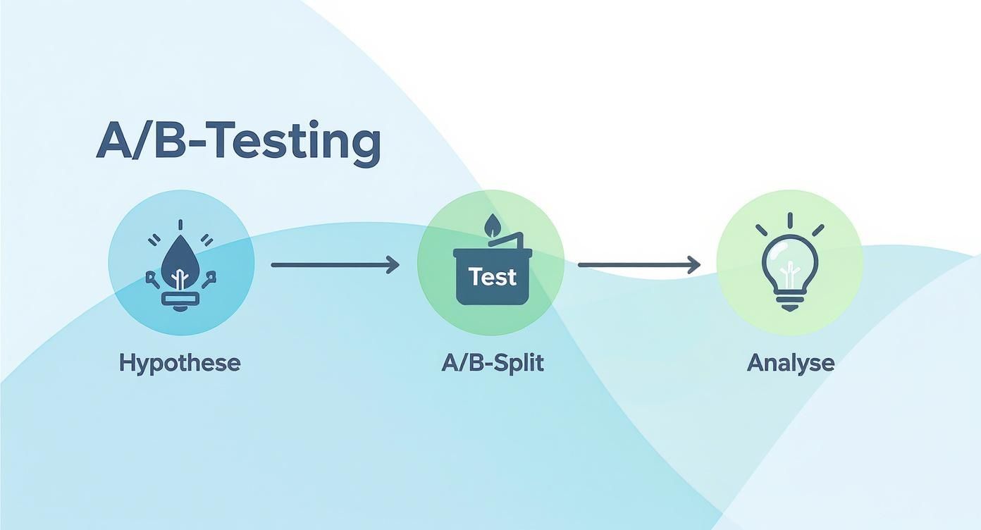
The cycle is clearly visible here: A well-founded idea (hypothesis) leads to practical implementation (testing) and culminates in a data-driven evaluation (analysis). This is precisely the basis of every successful optimization.
Long or short – which is better for my landing page?
The age-old question of the ideal length… the answer is a clear „It depends.“ Specifically, it depends on the complexity and perceived risk of your offer.
My rule of thumb is: as long as necessary, as short as possible. The length of your page must precisely cover the information needs and potential objections of your target audience.
For simple, low-risk actions – think of a simple newsletter subscription or the download of a free e-book – a short, snappy page Usually the best choice. You don't have to convince anyone for long here.
However, when it comes to complex, expensive, or highly technical products and services, the situation is quite different. Here, you need to build trust. In such cases, you achieve... Longer landing pages (long form) Almost always significantly better results. They give you the necessary space for social proof, detailed explanations, and addressing potential concerns.
Are you ready to take your online visibility to the next level? LinkITUp is your specialized SEO agency, which will support you with over 15 years Experience helps you reach the top of Google. Discover our tailor-made solutions. SEO services.