


Conversion rate optimization (CRO) is essentially about getting more out of your existing website visitors. Instead of simply increasing your advertising budget for more traffic, we focus on fully leveraging the existing potential. The goal? To eliminate friction points, specifically improve the user experience, and ultimately generate more sales, leads, or sign-ups – all while keeping marketing costs the same.
What Conversion Rate Optimization Really Means

Many people still associate CRO with the classic example: "Let's change the color of the 'buy' button from blue to green." But that only scratches the surface. True, sustainable conversion rate optimization is much more than that. It's a data-driven discipline that combines a deep understanding of user behavior with methodical experimentation.
We ask ourselves the crucial question: Why Are people not buying? Is it perhaps due to confusing navigation that makes getting to the shopping cart a test of patience? Are important trust signals like customer testimonials or quality seals missing? Or is the value proposition simply not communicated strongly enough on the landing page?
More than just a key figure
Of course, the Conversion Rate The focus is on this one number, but those who only look at this one figure miss the bigger picture. A well-thought-out CRO strategy always considers several key performance indicators (KPIs) to assess actual business success.
Here is a brief overview of the key performance indicators (KPIs) you should keep an eye on to holistically measure and manage the success of your CRO measures.
| Key Performance Indicator (KPI) | Description | Why it is crucial |
|---|---|---|
| Average Order Value (AOV) | The average value of each order. | A higher conversion rate is great, but if the AOV decreases at the same time, you might end up with less revenue. |
| Customer Lifetime Value (CLV) | The total value generated by a customer throughout their entire business relationship. | Good CRO not only promotes quick sales, but also creates loyal repeat customers with high long-term value. |
| Return on Investment (ROI) | The ratio of profit to invested marketing costs. | By getting more out of your existing traffic, CRO directly increases the profitability of your advertising campaigns. |
These KPIs give you a much clearer picture of how your optimizations are really impacting your business.
The enormous leverage of CRO in practice
Let's do the math: An online shop in Kaiserslautern has 10,000 visitors per month and a conversion rate of 1,5 %. That makes 150 sales. If we manage to reduce this rate to just [number missing] through targeted improvements... 2 % To increase sales, that's already 200 sales. That's a revenue increase of over 33 %, without spending a single extra cent on advertising.
Insights into the German market show that the average conversion rate in e-commerce at 2.01 percent However, top performers manage to achieve three to four times higher returns per marketing euro through targeted optimizations. Those who want to delve deeper will find further information in these [articles/resources]. Study results on conversion rate Exciting benchmarks.
This very leverage makes CRO one of the most cost-efficient growth strategies available. Instead of constantly pumping new money into acquisitions, we optimize the system to get the most out of what's already there.
Dissect your conversion funnel and uncover its weaknesses
The path from anonymous visitor to loyal customer is rarely straightforward. Imagine it like a funnel, the so-called... Conversion Funnel. A large number of potential customers enter the funnel at the top, but with each step along the way, some drop out. The real art of conversion optimization lies in finding and patching these leaks in the funnel.
Every click – or rather, every click that doesn't happen – tells a story. Your task is to decipher these stories. Instead of groping in the dark and randomly clicking a few buttons on your website, you need to proceed systematically. It's about specifically uncovering the obstacles that are preventing your users from progressing.

An honest, initial look at your analytics tool like Google Analytics 4 (GA4) can reveal some stark truths. Funnel visualizations like these show you at a glance how many users complete each step and – more importantly – where the biggest drop-offs occur.
This data analysis is the crucial first step. It allows you to identify the biggest points of friction in your customers' journey. Ask yourself: Where exactly does the process break down? Is it the jump from the shopping cart to checkout? Or do most customers fail even at the point of adding a product to their cart?
Asking the right questions about your data
Numbers alone are useless if they aren't interpreted correctly. Instead of getting lost in a sea of metrics, ask targeted questions that lead to concrete insights. Focus your analysis on the most critical sections of the Customer Journey. To understand the different Customer Journey Phases To better understand this, a deeper insight into actual user behavior is essential.
These key questions will help you move forward:
- Where do most people get off? Identify the page or step with the highest bounce rate. Is it a specific product category, the pricing page, or the very first step in the checkout process?
- Are there any technical hurdles? Segment your data by device type (desktop vs. mobile) and browser. A conspicuously high bounce rate among mobile users strongly suggests a problem with the responsive design.
- Which visitor sources deliver the worst results? Compare the conversion rates of visitors who come to your site via Google, social media, or directly. Perhaps the promise made in an advertisement simply doesn't match the reality on the landing page.
Qualitative data: A look behind the numbers
Quantitative data from analytics shows you the What. For example, that 70 % The user can cancel the checkout on the payment page. But they don't tell you that. Why. To find that out, you need qualitative insights that shed light on the human behavior behind the clicks.
This is exactly where tools like these come in Hotjar, Clarity or Full Story They come into play. You can think of them as a digital look over the shoulder of your users – and the information they provide is invaluable.
CRO is not a guessing game. It is a scientific method that combines quantitative data (what is happening) with qualitative insights (why it is happening) to make informed decisions that improve user experience and drive business growth.
Heatmaps They show you at a glance where users click, how far they scroll, and where their mouse moves. Do you recognize any patterns? Are many visitors clicking on an element that isn't even clickable? That's a clear indication of a UX problem.
Session recordings (session replays) They go even further. Here you can view anonymized recordings of individual visits. Observe how real people struggle with your site. You'll see where they hesitate, click back and forth in frustration ("rage clicks"), or have to fill out a form field repeatedly.
This qualitative data is pure gold. It transforms abstract numbers into tangible problems. The high drop-off rate in the order form suddenly becomes crystal clear when you see in a recording that the error message for an invalid postal code sends the user into an endless loop. Only when you combine both data sources – the hard numbers and the human behavior patterns – do you have a solid foundation for the next step: developing strong hypotheses.
Develop strong hypotheses and conduct effective A/B tests.

Okay, the analysis is complete. You now know where in your funnel people hesitate or drop out. This is where the really exciting part of conversion rate optimization begins: We transform data into concrete ideas.
Now it's about translating the collected insights – the raw data from analytics and the human perspectives gleaned from heatmaps or recordings – into a clear, testable hypothesis. Gut feeling alone isn't enough. Pure assumptions like "A green button is bound to convert better" rarely lead to success.
A strong hypothesis is the foundation for every successful A/B test. It's your compass, forcing you to think systematically about the problem, the solution, and the desired outcome. Without a sound hypothesis, every test is just a shot in the dark – and the results are barely interpretable.
The anatomy of a good hypothesis
To ensure your ideas are sound, you should adhere to a proven formula. This simple structure guarantees that each hypothesis is directly derived from your analysis results and contains all the crucial elements.
An effective hypothesis follows this pattern:
- If we [the planned change] implement,
- then [these users act differently],
- because [This explanation is based on your data].
Imagine your heatmaps show that mobile users simply overlook the small print delivery promise on the product page and then abandon the purchase.
Example hypothesis: If we Move the delivery information (e.g., "Free shipping in 1-2 days") directly below the "Add to cart" button and display it larger., then more mobile users complete a purchase, because The uncertainty regarding delivery costs and time is eliminated early on.
This structure is invaluable. It clearly defines what is being tested, what result you expect (a measurable KPI!), and why you believe it will work. This transforms a vague feeling into a data-driven bet.
Setting up A/B testing methodically correctly
With a solid hypothesis in hand, you can start the test. In the classic... A/B testing, Split testing, also known as split testing, involves randomly splitting your website's traffic. Group A sees the existing version of your site (the "control"), while Group B sees the new version with your changes.
Next, measure which version better achieves the desired goal – for example, more clicks on the shopping cart button. Very important: Only ever change the version that is already in use. only one variable per test. If you adjust the heading, button text, and an image simultaneously, you won't know in the end which of these changes was actually responsible for the result.
In CRO projects, we strive for meaningful results by... statistical significance of at least 95 % This ensures that the differences are not random. As a rule of thumb from practice: Each test variant should at least 100 conversions The top 20 Shopify stores are already achieving conversion rates of over [amount missing]. 3,2 % So there's often room for improvement. More on this later. Benchmarks in Conversion Rate Optimization You can read more about it here.
Choosing the right testing method
Depending on the complexity of your idea, various testing methods are available. Selecting the right method is crucial for obtaining reliable data.
Comparison of common testing methods
Find out which type of test is best suited to your specific challenge.
| Test method | Description | Optimal use case |
|---|---|---|
| A/B test | Two versions of a page (A and B) are directly compared to determine the more powerful version. | Ideal for testing individual, clearly defined changes – a new heading, a different call-to-action, or a changed button color. |
| Multivariate Test (MVT) | Multiple elements on a page are tested simultaneously in different combinations (e.g., 3 headings & 2 images). | Useful for optimizing landing pages with very high traffic, in order to find the best combination of many elements. However, it requires an enormous amount of data. |
| Split-URL Test | The traffic is split across two completely different URLs, for example, for a radical redesign of an entire site. | Perfect for fundamental redesigns, testing a completely new layout or a changed user flow. |
For most companies, especially in a region like Kaiserslautern, classic A/B testing is the most pragmatic and effective starting point. Tools such as VWO, Optimizely or AB Tasty making technical implementation easier today than ever before.
One last practical tip: Give the test enough time! Don't prematurely terminate it just because one variant is ahead after two days. Let the test run for at least a full business week to account for natural fluctuations in user behavior. Patience pays off here.
Tried-and-tested levers for instantly more conversions
So, the data has been analyzed, the initial hypotheses are in place. Now things get exciting, because we're getting down to brass tacks: implementation. This is where the wheat is separated from the chaff, because now it's about transforming the theory into tangible results and specifically adjusting the levers that will really make a difference.
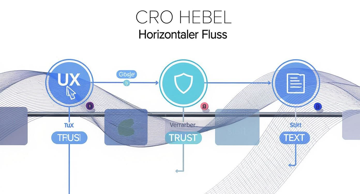
We focus on two areas that mesh together like gears: the User Experience (UX) and that Copywriting. A buttery-smooth user interface is useless if the texts are dull – and the best advertising copy is wasted if users get lost on the page.
User experience as the foundation for conversions
Imagine the user experience as the invisible framework of your website. If it's stable and logically structured, your visitors will navigate it effortlessly. But if the framework creaks or entire steps are missing, they'll abandon the site. Good UX design means eliminating any friction, uncertainty, or hesitation.
Three points are absolutely crucial here:
- Intuitive navigation and structure: Can your visitors find what they're looking for instantly? A user who has to think for even a few seconds about where to click next is already halfway to leaving. Ensure crystal-clear menu navigation and a self-explanatory page structure.
- Mobile first or mobile dead: The reality is: Most traffic today comes from smartphones. A website that takes forever to load on mobile, is fiddly to use, or requires constant zooming is a definite conversion killer. My advice: Always test every change on a mobile device first.
- Charging time is money: Countless studies repeatedly confirm it: Every second your page takes longer to load costs you conversions. Compress images, clean up your code, and invest in good hosting. A page that's ready to go in under two seconds is the standard today, not a luxury.
Trust is the currency of the internet. Without trust, no transaction takes place. Every single factor, from page speed to the clarity of your texts, contributes to this trust account.
A first-class user experience not only leads directly to more sales, but also strengthens trust in your brand.
Building trust with targeted trust signals
A user will only buy from you if they trust you. This trust doesn't fall from the sky; you have to actively earn it at every touchpoint of the customer journey. Trust Signals These are your best helpers. They are visual and textual elements that signal to the user: "Here you are safe, here you will make a good decision."„
What actually works in practice:
- Customer reviews and testimonials: Genuine testimonials from satisfied customers are the strongest social proof available. Place authentic reviews prominently on product pages and, most importantly, during the checkout process.
- Quality seals and certificates: Well-known seals of approval such as Trusted Shops or TÜV certificates immediately create a feeling of trustworthiness and security. This is particularly important when it comes to entering payment details.
- Transparent contact options: A clearly visible phone number, a local address (invaluable for businesses here in Kaiserslautern!) and perhaps even a live chat create a sense of connection and show that real people are behind the website.
The numbers prove how enormous the influence of these elements is. The integration of customer testimonials and success statistics alone can increase the conversion rate by an average of... 17 to 23 percent increase rates. Behavioral targeting can even raise them by [amount missing]. 47 % Companies that consolidate their customer data in a Customer Data Platform report an average increase of [missing information]. 37 percent. You can find more information about these benchmarks in this study on conversion optimization.
Words that sell: the power of copywriting
Your texts are your digital salesperson. You only have a few seconds to convince, address objections, and motivate the visitor to take action. Good copywriting is less about art and more about a craft based on psychology and crystal-clear communication.
The value proposition
Your value proposition must tell visitors at first glance what problem you solve, for whom, and why you are the best choice. This is the most important sentence on your entire website.
- Previous (interchangeable): „"We offer innovative marketing solutions."“
- Afterwards (specifically and strongly): „"We will double the leads for craft businesses in Kaiserslautern – guaranteed within 90 days."“
Crystal-clear call-to-actions (CTAs)
A call to action isn't just a simple button; it's a direct prompt to take action. Ditch the generic phrases like "Next" or "Submit"! Be specific and communicate the immediate benefits.
- Instead of "Register": „"Get your free e-book now!"“
- Instead of "Buy": „"Book my place in the course"“
An often overlooked but effective lever is optimizing your external links. A clearly named link simply appears more trustworthy and encourages clicks. Learn how. Shorten and rename links It not only ensures order, but can also lead to more clicks and thus indirectly to better conversions.
Compelling product descriptions
Don't write about features, write about benefits. Put yourself in your customer's shoes: What's in it for them? Which of their unspoken questions does this answer?
- Characteristic: „"This laptop has 16 GB of RAM."“
- To use: „"Work effortlessly with over 10 programs simultaneously – without any lag or waiting."“
The combination of technical perfection, trust-building measures, and compelling texts is the key to... Conversion Rate Optimization. If you understand your website as an ongoing conversation with the customer, you'll find the right levers to turn visitors into loyal customers. Incidentally, all these principles are key components of a successful website. Landing page optimization, which lays the foundation for high completion rates.
Establishing a sustainable CRO process within the company
Individual A/B tests are a good start, but they only scratch the surface. Real Conversion Rate Optimization It's not a sprint, but a marathon – a continuous process that must be firmly anchored in the company culture. It's about creating a mindset where data-driven decisions replace gut feeling and continuous learning becomes part of the daily routine.
Such a sustainable CRO process follows a simple yet extremely effective cycle: analyze, formulate hypotheses, test, and learn from the results. This cycle repeats indefinitely, ensuring that your company remains agile and constantly adapts to your users' behavior. This is precisely how a genuine competitive advantage is created, one that extends far beyond quick wins.
The three key levers we constantly adjust in this process are user experience, user trust, and text quality.
Every optimization – be it in user guidance, trust signals, or advertising copy – is part of this larger, constantly repeating process.
Plan a test roadmap and set priorities
Once you start brainstorming optimization ideas, the list quickly becomes very long. The real challenge lies in not just testing haphazardly, but in proceeding strategically and with a plan. This is precisely why you need a test roadmap. It's your plan, outlining which tests are performed, when, and why.
To filter out the most promising ideas from the flood of ideas, the PIE framework Proven in practice. It evaluates each hypothesis based on three simple criteria:
- Potential: How much potential for improvement is there on the page you want to test? Pages with high traffic but poor performance are practically screaming for optimization.
- Importance: How valuable is the traffic to this page for your business? Changes to the checkout process usually have a more direct impact on revenue than an adjustment to the "About Us" page.
- Ease (simplicity): How quickly and with what effort can the test be implemented technically?
Rate each idea for each of these three criteria on a scale of 1 to 10. The hypotheses with the highest overall score move to the top of your roadmap. This approach ensures that you allocate your limited resources precisely where they will have the greatest impact.
Establish a culture of learning
Let's be honest: Not every test will be a resounding success. Many A/B tests fail or don't produce statistically significant results. But that's no reason for frustration; it's a valuable learning opportunity. A failed test proves that your assumptions about user behavior were wrong—and that's just as important an insight as a successful test.
Document the results of every single experiment, whether win, lose, or draw. Record what you learned and how these insights will influence your future hypotheses. Over time, this knowledge base will become an invaluable resource for your entire team. It will help you interpret key performance indicators (KPIs) correctly and draw the right conclusions. To better assess the relevance of the metrics, it is helpful to identify the most important ones. KPIs in SEO to understand, as these are often closely linked to CRO goals.
To further accelerate the CRO process, it is also possible to Artificial intelligence AI-powered tools play a crucial role. They can help analyze vast amounts of data faster, identify patterns in user behavior, and even create personalized testing experiences.
By fostering a culture where data-driven testing and learning are firmly embedded in daily work, you make your company more resilient and effective. This transforms conversion rate optimization from a mere marketing tactic into a core strategy for sustainable growth.
Practical questions: What you always wanted to know about conversion rate optimization
Over the years, I've heard the same questions time and again when it comes to optimizing conversion rates. In this section, I'll answer the most frequently asked questions and give you clear, practical advice. This will help you avoid the typical pitfalls and set up your projects correctly from the start.
How much traffic do I really need for A/B testing?
That's the million-dollar question in the CRO world, and the honest answer is: it depends. There's no magic number that works for everyone. But in my experience, a rule of thumb has proven useful: Each test variant should have at least 100 conversions. to achieve this, so that the results are statistically sound.
Let's do the math: Assuming your page has a conversion rate of 2.1 per thousand visitors, you'll need approximately 5,000 visitors for each variation. For a simple A/B test with the original and a new variation, this adds up to... A total of 10,000 visitors during the test period.
If your traffic or conversion rate is significantly lower, traditional A/B testing is often not the right approach. In such cases, qualitative analyses such as user testing or more radical design adjustments are usually more effective.
Which changes will have the greatest impact?
Everyone's looking for that one "secret trick" that will double the conversion rate overnight. But reality is different. It's rarely the small cosmetic adjustments, like the color of a button, that bring about the breakthrough. The greatest impact almost always comes from changes that delve deep into user psychology.
The most effective levers are usually:
- The value proposition: Does a new visitor immediately understand why they should buy from you and not the competition? Is your unique benefit communicated crystal clear?
- Eliminating friction points: Anything that slows down, confuses, or annoys a user costs conversions. This can include confusing forms, unexpected shipping costs in the final step, or slow loading times.
- Building trust: People buy from people (and brands) they trust. Genuine customer reviews, well-known quality seals, and transparent pricing are invaluable here.
One important takeaway: Don't test colors, test hypotheses. A strong, data-driven assumption about your users' behavior is the real engine for significant improvements.
Desktop or mobile – which should I focus on?
The final answer lies in your own analytics data, but for almost all companies, the motto today is quite clear: Mobile first! Take a look inside your Google Analytics-account and look at the distribution of traffic across different device types. You'll be amazed.
In most industries, the lion's share of traffic now comes via smartphones, even if the final purchase is often still made on a desktop computer. This means your mobile site is your business card. It's where the first impression is made and interest is sparked. A poor mobile experience will drive away potential customers long before they even have a chance to convert on a PC or laptop. So always optimize for the mobile experience first.
What if a test doesn't provide a clear result?
If a test results in a draw, that's not a failure – on the contrary, it's a valuable insight! It shows you in black and white that the change you tested made no noticeable difference for your users. That's pure knowledge for your future work.
Document the results and dig deeper: Why didn't the hypothesis work? Was the change perhaps too subtle? Or were you trying to solve a problem that wasn't actually a problem for your users? Such testing prevents you from wasting time and money on an ineffective measure. Use this insight to refine your next hypothesis.
Do you want to ensure your website is reaching its full potential? We at LinkITUp We identify the weaknesses in your online presence and develop a tailored SEO and CRO strategy that turns visitors into enthusiastic customers. Contact us for a free initial consultation and let's work together to find out how we can sustainably improve your ranking and conversion rate.