


When we talk about optimizing a landing page, we really only mean one thing: designing the page in such a way that a visitor sees exactly what they're looking for. a desired action ...executes. Whether that's a purchase, newsletter signup, or whitepaper download is irrelevant at first. The goal is to transform anonymous visitors into... active customers or leads to do this by removing all points of friction and intuitively guiding the user to the goal.
What makes a strong landing page at its core
Before we start tweaking buttons or headlines, we need to lay the foundation properly. A landing page isn't a digital brochure, but a precision tool with a crystal-clear mission. Unlike a typical website, which is often overloaded with menus and information, a good landing page focuses relentlessly on a single offer and a single call to action.
This focus is invaluable. Every single element – from the headline to the text to the image – must subtly nudge the visitor towards conversion. Distractions like excessive navigation or links to other topics are poison here and drive up bounce rates.
The psychology behind the click
Successful landing page optimization is largely applied psychology. Visitors decide in fractions of a second whether a page is relevant and trustworthy. The most important messages must therefore immediately catch the eye. The linchpin here is the value proposition. It answers the user's one crucial question: "What's in it for me, and why should I care?"„
A solid foundation combines a logical structure with psychological incentives. It's not just about listing facts, but about building trust and subtly motivating the visitor to take action. Without this foundation, all further optimizations are merely cosmetic.
This infographic summarizes the basic process – from structure and trust building to the final call to action.
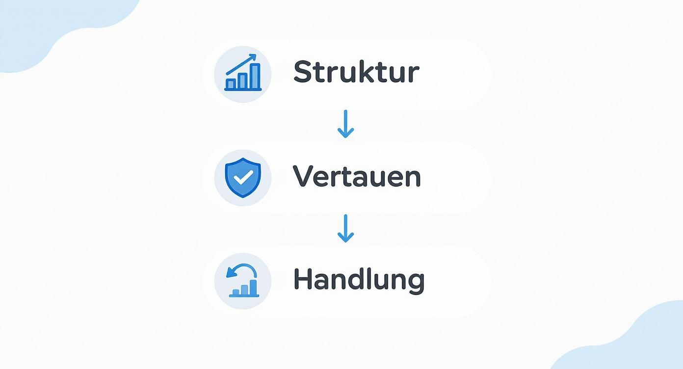
It's clear: an intuitive structure is the foundation for everything. Targeted trust signals build upon this, ultimately paving the way for a successful conversion.
Trust: The most important currency online
Online, trust is everything. New visitors are naturally skeptical. Our job is to dispel that skepticism as quickly as possible. We achieve this with targeted trust signals.
- Customer testimonials: Genuine testimonials from satisfied customers are pure gold. They provide "social proof"—the evidence that others have already had positive experiences.
- Quality seals and certificates: Well-known seals of approval such as Trusted Shops or TÜV immediately create a feeling of security and professionalism.
- Clear contact details: A clearly visible phone number or address signals that a real company is behind this, not an anonymous provider.
- Professional design: A modern, flawless and appealing design simply appears more professional and unconsciously builds trust.
These elements may seem small, but they often determine whether someone shares their data or completes a purchase. A landing page without such signals often feels insecure and uninviting.
How structure and user guidance determine success
The arrangement of information is crucial for whether the message is received at all. Hardly anyone reads a website word for word. We scan it. Our eyes usually follow an F or Z pattern, taking in the most important areas first. A well-thought-out structure places the key elements exactly where the eye naturally falls.
At the same time, the technical aspects shouldn't be neglected. Especially in the German market, we repeatedly see how significantly loading time and overall usability influence conversion rates. While average websites often languish at 1-2 per-100,000 conversions, specifically optimized landing pages achieve rates of... 6.6 % and more. A delay in loading time of just one second can already increase conversions by up to 7 % break in. This shows how closely technology and marketing success are linked. You can find out more in this. Detailed guide to landing pages for service providers at netzpunkte.de.
Texts and visuals that truly convince
A solid foundation is in place, but now comes the real work: the content your visitors see, read, and experience. Good design and compelling copy aren't a matter of chance, but the result of meticulous craftsmanship. This is precisely where it's decided whether a visitor stays and becomes curious, or leaves in frustration.

It all starts with the headline. It's undoubtedly the most important single element of your landing page. If this first line doesn't immediately grab attention and make it clear what it's about, the rest of your painstakingly written text won't even be read. Think of it as your promise to the user: "Hey, you've come to the right place – I have the solution to your problem."„
The Art of the Perfect Headline
A strong headline is specific, crystal clear, and sparks curiosity. Phrases like "Welcome to our site" are wasted space—an absolute no-go. Instead, directly communicate the greatest benefit your offer provides. A proven method I frequently use is the so-called "4 U formula." It helps you get your headline across concisely.
- Urgent: Creates a feeling of urgency or an immediate need.
- Unique: Highlight what makes your offer stand out from the competition.
- Useful: Communicates a very specific benefit for the reader.
- Ultra-specific: Make your promise tangible and credible.
You don't need to desperately try to cram all four points into one line. Often, a clever combination of two or three of these elements is enough to create a really strong headline. This way, a weak "Our new software" becomes a powerful "Reduce your admin workload by 5 hours "Per week – guaranteed." The difference? Day and night.
To find the right headline for your goal, it's helpful to know the different approaches. The following table gives you a quick overview.
Comparison of Headline Types
| Headline type | Description | Example | When to use it? |
|---|---|---|---|
| Benefit-oriented | Focus on the direct benefit for the customer. | „"Finally, a restful sleep – with our weighted blanket."“ | Ideal for products/services with a clear, measurable result. |
| Question Headline | It directly addresses a problem or a wish of the reader and encourages reflection. | „"Are you looking for a tax advisor in Munich who really thinks ahead?"“ | Well suited to establishing a direct connection with the target group and engaging them in dialogue. |
| Social Proof | Use the power of the crowd by pointing to popularity or trust. | „"Over 10,000 satisfied customers already rely on our accounting software."“ | Especially effective for new visitors to quickly build trust. |
| Command/Request | It directly prompts the reader to take action. | „"Get your free SEO check now!"“ | Perfect for clear calls to action and offers that require an immediate response. |
As you can see, each type has its own strengths. Choose the approach that best suits your offer and the awareness level of your target group.
Copywriting that converts and ranks
After the headline, the real work of persuasion begins – the copy. Here, the goal is to engage the user with compelling arguments while simultaneously sending the right signals to search engines. The trick is to break down complex information into easily digestible, appealing bites.
Let's be honest: Nobody likes reading huge walls of text online. Therefore, use short paragraphs, meaningful subheadings, and bullet points to break up the text and make it scannable. Tell a story: Start with the customer's pain point, present your solution as the shining hero, and paint a vivid picture of how the customer's life is transformed for the better. This emotional connection is often a thousand times more powerful than a dry list of features.
The right tone is absolutely crucial. Speak the language of your target audience! A B2B offer for IT managers needs a different approach than an online shop for handmade jewelry. These nuances are a central component of a clever content strategy that goes far beyond simply placing keywords. If you want to delve deeper, read here how to create an effective Develop a content strategy can.
A good landing page copy doesn't just answer the question "What is it?", but above all, "What's in it for me?". The focus must always be on the benefit for the customer, not on the product's features.
Personalization is an increasingly important factor here. AI-powered tools can now dynamically adapt content, images, and even calls to action to each individual visitor. Such customized landing pages can increase conversion rates by up to 300 % compared to static pages, because they simply create a much more relevant experience.
Visual elements that reinforce your message
Images and videos are far more than mere decoration. They are powerful tools for conveying emotions, explaining complex issues, and building trust. Often, a single, high-quality product image or a short explainer video is more persuasive than a hundred words of text.
Make sure to use authentic images that show your offering in a real-world context. Classic stock photos often appear impersonal and interchangeable, and can undermine the credibility of your website. Real photos of your team, your product in action, or satisfied customers, on the other hand, create a personal connection and make you seem approachable.
Videos are particularly effective for demonstrating processes or bringing testimonials to life. A major advantage: they keep users on your site longer, which in turn sends a positive signal to search engines. But be careful: always keep an eye on file size! Huge image and video files are one of the most common reasons for long loading times, which kill your conversion rate. Use modern formats like... WebP for images and compressed videos, to find the perfect balance between quality and performance.
The key elements: How to turn interest into action
Okay, you've piqued your visitors' interest with good text and appealing images. Great! But now comes the crucial moment – the conversion. This is where the elements that motivate the user to take action need to be spot on: the calls to action (CTAs), the forms, and the small but important trust signals.

Don't see these building blocks as mere accessories. They are the engine of your landing page. An unclear call to action or a cumbersome form can scare away even the most motivated prospect at the last minute.
The perfect call to action (CTA): More than just a button
A CTA is the ignition key. A simple button labeled "Submit"? That's simply not enough anymore. A strong CTA communicates a crystal-clear benefit and immediately motivates a click. Instead of passive phrasing, you need active, benefit-oriented verbs.
The difference is enormous. Compare: "Submit form" or "Request free analysis now." The second CTA works much better because it puts the result front and center – the user knows what valuable benefit they'll receive.
Design plays an equally important role. A CTA must literally jump out at you. Here's how to achieve that:
- Strong visual contrast: The button needs a color that clearly stands out from the rest of the page and attracts attention.
- Strategic placement: Place the CTA exactly where the eye naturally lands, usually right after a strong sales argument.
- Plenty of space: Give the button some breathing room. It shouldn't get lost among other elements.
A common mistake I see time and again is focusing too much on the "perfect" color of the button. Whether it's green or orange is often secondary. Far more important are the contrast with the surroundings and the unambiguous message.
Forms that aren't intimidating
Forms are often the biggest conversion killer of all. Every single field is an obstacle and increases the likelihood of abandonment. The golden rule is therefore: Ask only the essential questions!
For a simple newsletter subscription, all you need to do is... 99 % In most cases, the email address is unnecessary. Do you really need the phone number, company address, and job title for the very first contact? In most cases, the answer is no. Reduce the fields to the absolute minimum.
One clever method to lower the hurdle even further is... Multi-step forms. Instead of a long, daunting form, break the process down into several small, logical steps. The user starts with simple information like name and email address and only provides further details later. Psychologically, this is smart: they have already made a small "micro-commitment" and are therefore more likely to complete the process.
Don't just focus on the number of fields. A form must be technically sound and usable by everyone. The key word here is accessibility. Ensure that all users, regardless of their abilities, can fill out your forms without any problems. Clear labels and screen reader support are essential. You can find more information on this topic in our article, which 5 characteristics of accessible websites A closer look.
Building trust at the right moment
Even if the CTA and form are perfect, a final spark of doubt can prevent conversion. This is precisely where trust signals come into play. Strategically place them near the conversion elements.
Imagine this scenario: A user hesitates to enter their data. A short, authentic customer testimonial right next to the form can be the decisive push. It sends the message: "Others have been in your situation, they did it, and they were happy with the result."„
Other strong anchors of trust are:
- Well-known quality seals: A TÜV seal or a "As seen on..." strip with the logos of well-known media outlets immediately creates a serious impression.
- Privacy policy: A simple sentence like "Your data is safe with us" directly below the email field can work wonders.
- Facts and figures: Statements like "Already over 5,000 satisfied customers" provide social proof and reinforce the credibility of your offer.
These elements often operate subconsciously, but their psychological impact is enormous. They alleviate the user's fear of making the wrong decision and give them the necessary confidence to make the final click.
The technical foundation of your landing page: SEO and performance
The best landing page in the world is useless if no one can find it or if it takes forever to load. The most creative design and the most compelling message are wasted if the technical foundation isn't sound. Here, we focus on the invisible but absolutely crucial factors that determine success or failure.

To be honest: visitors are impatient. A delay of just one second can already reduce conversions by [amount missing]. up to 7 % Let yourself be broken into. First impressions count – and these are often formed even before the user has read a single word.
Charging time is not a luxury, but a necessity.
When we talk about optimizing landing pages, speed is absolutely crucial. Aim to stay under the magic two-second mark. Every millisecond counts.
There are usually two major obstacles: unoptimized images and overloaded code.
- Intelligent image compression: Sure, high-resolution images look great, but they are often huge data packages. Use tools like TinyPNG or Squoosh, to drastically reduce file size – often without any visible loss of quality. Modern formats such as WebP are worth their weight in gold here, as they offer excellent compression with high quality.
- Keep code lean: Every unnecessary line of code, every whitespace character in CSS or JavaScript files is ballast that the browser has to load. So-called "minifier" tools automatically remove this ballast, making your files noticeably smaller and faster.
Speed isn't just a technical detail; it's a direct signal of trust. A website that loads instantly appears professional and respects the user's time. A slow website, on the other hand, practically screams, "We haven't done our homework."„
Mobile Usability: The Decisive Factor
Most people browse the internet using their smartphones these days. A landing page that looks great on a desktop but is a nightmare on a mobile phone is doomed to fail. Responsive design is no longer an option; it's an absolute necessity.
But it's about more than just adapting everything to the smaller screen. True mobile usability means:
- Large clickable areas: Buttons and links must be designed so that they can be easily tapped with the thumb. Nothing is more frustrating than tiny links that are almost impossible to use.
- Legible font: The text must be easily readable without annoying zooming. A good rule of thumb is a font size of at least... 16 pixels for the running text.
- Simple forms: Filling out forms on a smartphone is a real pain. Reduce the number of fields to the absolute minimum. Use mobile-friendly input fields so that, for example, the keypad appears automatically when entering a phone number.
Always remember: Mobile users are often on the go, distracted, and have zero patience. The experience must be seamless and completely intuitive.
On-page SEO: The basics for visibility
For your landing page to attract traffic, it needs to be found and correctly ranked by search engines like Google. Even if the page is primarily intended for paid campaigns, such as Google Ads, a solid on-page SEO foundation is never a bad thing – it can even generate valuable organic traffic.
The Title Tag and the Meta Description These elements are your calling card in the search results. They must pique the user's interest and contain the most important keyword. Think of these two elements as a mini-advertisement for your page.
The heading structure within the content itself ensures (H1, H2, H3) for a clear hierarchy. The H1 title is the main heading and should contain your primary keyword. It immediately signals to users and search engines what the page is about. Thorough keyword research is essential for this. We explain how to find the right terms to reach your target audience in our Instructions for keyword research.
Of course, the texts should also contain relevant keywords, but always in a natural way. The clumsy stringing together of keywords (keyword stuffing) is long outdated and does more harm than good to your ranking. The focus should always be on a high-quality, useful text for the reader.
This table summarizes the most important technical to-dos for you, so that you don't overlook anything.
Checklist for technical optimization
A step-by-step overview of the most important technical measures for improving the loading time and mobile usability of a landing page.
| measure | Tool/Method | Expected impact |
|---|---|---|
| Measure charging time | Google PageSpeed Insights, GTmetrix | It identifies bottlenecks and provides concrete recommendations for action. |
| Compress images | TinyPNG, Squoosh, WebP format | Significantly reduces file size and speeds up page loading. |
| Minify code | Online minifier tools, CMS plugins | Reduces the size of CSS and JavaScript files for faster download. |
| Test mobile view | Google Mobile-Friendly Test, Browser Tools | Ensure that the page is displayed correctly on all devices. |
| Check clickable areas | Manual testing on the smartphone | Improves user-friendliness and reduces the bounce rate. |
| Optimize meta tags | SEO plugins (e.g. Yoast), on-page checkers | Increases the click-through rate (CTR) in search results. |
By consistently working through these points, you will create a stable technical foundation on which your content and offers can reach their full potential.
Regional optimization: How to attract customers from your neighborhood
For most companies in Germany, local ties aren't just a nice bonus, but the very foundation of their business. Whether it's a craft business, a restaurant, or a law firm – their customers usually come from the immediate vicinity. This is precisely where your landing page needs to focus to reach this extremely valuable target group.
Think about search queries like "tax advisor Hamburg" or "bike shop Berlin-Kreuzberg." Behind these lies a strong purchase intent. People searching like this often have an urgent need and are just one click away from making contact or visiting your business. Your landing page thus becomes a digital business card for the people right on your doorstep.
Local keywords as a door opener
It all starts with the right keywords. These are usually combinations of your service or product and a specific location – a city, a district, or even a postal code. You should naturally integrate these terms into the most important areas of your website.
- In the main heading (H1): Instead of just "Professional teeth cleaning", it's better to write "Professional teeth cleaning in Munich-Schwabing". That's direct and unambiguous.
- In the text: Explain how you support customers from the region, and casually mention relevant place names along the way.
- In the metadata: The title tag and meta description are your calling card in Google search results. Your location absolutely must be included here.
These small adjustments have a big impact. They immediately signal to both visitors and search engines: I've come to the right place. This creates a direct connection and helps you stand out from the competition nationwide.
Building trust through closeness
A local landing page must exude authenticity. You don't want to come across like a faceless corporation, but rather like the trusted expert next door. You achieve this with very specific, local trust-building elements.
A regionally optimized landing page simply feels familiar to visitors. It speaks their language, understands their surroundings, and demonstrates its connection to the community through local references. This sense of connection is an invaluable advantage.
A simple yet powerful tool: an interactive Google Maps map that displays your location. This provides orientation and proves that you really exist. Even more convincing are regional customer testimonials. A testimonial from "the Schmidt family from Nuremberg" has a much stronger impact on a potential customer from Nuremberg than an anonymous review.
Even small, location-specific offers can work wonders – for example, a small discount for new customers from a specific postal code area.
Building the bridge to the Google Business Profile
Your landing page rarely stands alone. For local search, this is... Google Business Profile (Still known to many as Google My Business) Your most important partner. Ensure your profile is well-maintained and link directly from there to your regionally optimized landing page.
This connection creates a powerful synergy. Good reviews and up-to-date information in your company profile build trust, and the landing page then takes care of the rest, converting the prospect into a customer. The numbers speak for themselves: Every month there are approximately 97 billion Local search queries. Almost 46 % of all Google searches have a local connection, and are plentiful. 28 % These lead to a purchase. Regional optimization is therefore not a luxury, but crucial for business success. You can find more exciting facts about this in this [link/document]. Article about digital marketing statistics.
Measure success and grow systematically with A/B testing
Launching a landing page is only half the battle. The real work—and where the magic happens—begins afterward: with continuous optimization. This isn't a one-off project, but an ongoing process based on hard data, not a vague gut feeling. This is precisely where A/B testing comes in: a systematic method for finding out what truly resonates with your target audience.
Basically, it is A/B testing, Split testing, often called averaging, is simply a controlled experiment. You create two versions of your landing page: the original (version A, the control) and a slightly modified version (version B, the variant). The incoming traffic is then randomly split between the two versions. Finally, you see which version achieves the better conversion rate. This allows you to make decisions based on real user behavior.
How to set up the first A/B test correctly
Don't worry, getting started with testing doesn't have to be complicated. The key to success lies in a structured approach and focusing on just one isolated change at a time. If you adjust too many elements at once, you won't know which change was truly responsible for the success (or failure).
The best way to start is with a clear hypothesis. This sounds more scientific than it actually is. You simply formulate an assumption that you want to test. A classic example would be: "I believe that a more specific call to action text like 'Request your free checklist now' increases the click-through rate because it shows users the next step much more clearly than the generic 'Submit'."„
The biggest mistake in A/B testing? Not starting at all, for fear that it's too complex. Start small: Test a new heading or a different color for your button. Such small changes can often have surprisingly large effects and provide you with valuable insights immediately.
What should you test? The elements with the greatest leverage.
Not every test is the same. Some changes have a significantly greater impact on the conversion rate than others. If you want to test your... Optimize landing page If you want to achieve this, you should therefore initially focus on the elements with the greatest impact.
- The headline: This is often where the greatest leverage lies. Try comparing a benefit-oriented headline with one that sparks curiosity, or one that asks a direct question.
- The call to action (CTA): Experiment with the text ("Buy now" vs. "Add to cart"), the color (more contrast!), or even the placement on the page.
- Hero images or videos: A picture is worth a thousand words, right? Test a purely product-focused image against an emotional image with people to see which works better.
- The length of your form: What happens if you reduce the number of fields from five to three? Measure whether this noticeably increases the completion rate.
- Social Proof: Where do customer testimonials work best? Test whether they should be placed directly below the headline or perhaps next to the CTA button.
These elements are usually the first points of contact for visitors and directly influence the decision to convert.
Interpreting Results Correctly
An A/B test only delivers reliable results when enough data has been collected to make a statistical significance to achieve this. This simply means that you can be sure your result is not pure chance. Most common testing tools, such as the former Google Optimize, Optimizely or VWO They will show you when this point is reached – usually with a statistical certainty of 95 %.
Very important: Don't prematurely end a test just because one variant is slightly ahead after two days. User behavior can change significantly throughout the week (e.g., over the weekend). Ideally, let the test run for at least one, preferably two weeks, to cover a full business cycle.
Ultimately, the winning version becomes the new standard version, and the process starts again. Every single test result—whether positive or negative—is a valuable learning experience. This way, your landing page improves a little bit with each test.
Practical questions about landing page optimization
In our daily agency work, we constantly encounter the same questions when it comes to optimizing landing pages. I've compiled the most common ones for you here and provide clear, practical answers so you can avoid the typical pitfalls from the start.
How long should a landing page be?
There's no one-size-fits-all answer – a "perfect" length doesn't exist. The optimal length always depends on two things: the complexity of your offer and how well-informed your target audience already is about it.
If you're offering something simple, like a free ebook download, a short, snappy page is often sufficient. The benefit is immediately clear, so you don't need many words. However, if it's expensive software or a complex consulting service, you'll need to do significantly more convincing. In such cases, a longer page that goes into detail, shows customer testimonials, and presents case studies is almost always the better choice.
My rule of thumb is: As long as necessary, but as short as possible. For every single element on the page, ask yourself: "Does this help convince the visitor of my offer?" If not, remove it.
How many CTAs are ideal?
Here, less is almost always more. Every landing page should a single, crystal-clear goal Pursue this goal. And your primary call to action (CTA) should reflect precisely this goal.
For longer pages, it makes sense to place the CTA button in several locations – for example, after a compelling value proposition or at the very end of the page. The idea behind this is simple: if a visitor is convinced, they shouldn't have to search for the button. However, it's important that all these buttons are aligned with the page layout. same Calls to action are essential. Multiple CTAs with different goals on one page only create confusion and severely damage your conversion rate.
What are the typical mistakes beginners make?
There are a few classic mistakes I see time and time again. If you avoid these from the outset, you're already a huge step ahead of most people.
- Unclear message: The visitor lands on the page and after three seconds still has no idea what it's about or what's in it for them. The headline and the first sentence have to clarify that immediately – no ifs, ands, or buts.
- Too many distractions: A navigation bar, social media icons, or links to other blog articles are detrimental to a landing page. Every click that leads away from the actual goal is a lost customer.
- Poor mobile optimization: Text is tiny, buttons are almost impossible to tap – the site is a nightmare to use on a smartphone. Since the majority of people browse the internet on mobile devices these days, this is a major conversion killer.
- Poor loading times: Who likes to wait? If loading takes too long, the visitor is gone before they've even seen your message.
By paying attention to these fundamentals, you create a strong foundation. This allows you to build strategically on it, gradually transforming your landing page into a true conversion magnet.
Do you want to ensure that your landing page not only looks good, but is also technically and content-wise set up so that it ranks at the top of Google? LinkITUp is your experienced partner for sustainable SEO success. We analyze your website, uncover untapped potential, and develop a strategy that truly works. Learn more about our SEO services now at seobuchen.com/.